Debunked: Economic Implications of COVID Lockdowns
December 17th, 2020
- Lockdown policies have a negative economic impact on GDP. The most open countries experienced an average GDP increase of 2.85%, while the most restricted countries saw GDP decline by an average of 6.50%
- Lockdowns did not have a material impact on the unemployment rate. In fact, the countries with stricter lockdowns experienced a smaller jump in unemployment rate than countries that remained open
- Lockdown impact on health is not as conclusive, mostly because cases & deaths are not an accurate measure. This is due to countries enforcing lockdowns to halt the spread of COVID after an outbreak
To shut down or not to shut down. That has been a topic of debate amongst policymakers with the spread of COVID. Below, an analysis is performed assessing how the economies of each country performed given the lockdown measures they took.
It is presumed that countries must decide between economy or health. Data shows that this trade-off is partly true. The sweet spot is somewhere between stay-at-home orders and complete mobility.
Methods Used for Measuring Impact
Mobility & strictness of lockdown: Google’s Community Mobility Report was used to measure the lockdown severity of each country. This “mobility index” tracks the sum of movement trends in workplace and residential areas, as of December 11, 2020.
Economic measures: Year-over-year GDP change was the first economic metric used to measure the impact of lockdowns. The change in the unemployment rate during 2020 was the second economic metric analyzed. How much the unemployment rate changed from the most recent data available for 2020, compared to the start of 2020.
Health measures: The number of COVID cases per million population was one health metric used. This is the number of people infected with COVID-19 for every million people in the population. The other was death rate per 100K population, the number of people that died for every 100,000 people in the population.
A quadrant matrix for each above metric is used to visually represent rankings.
Economic Data
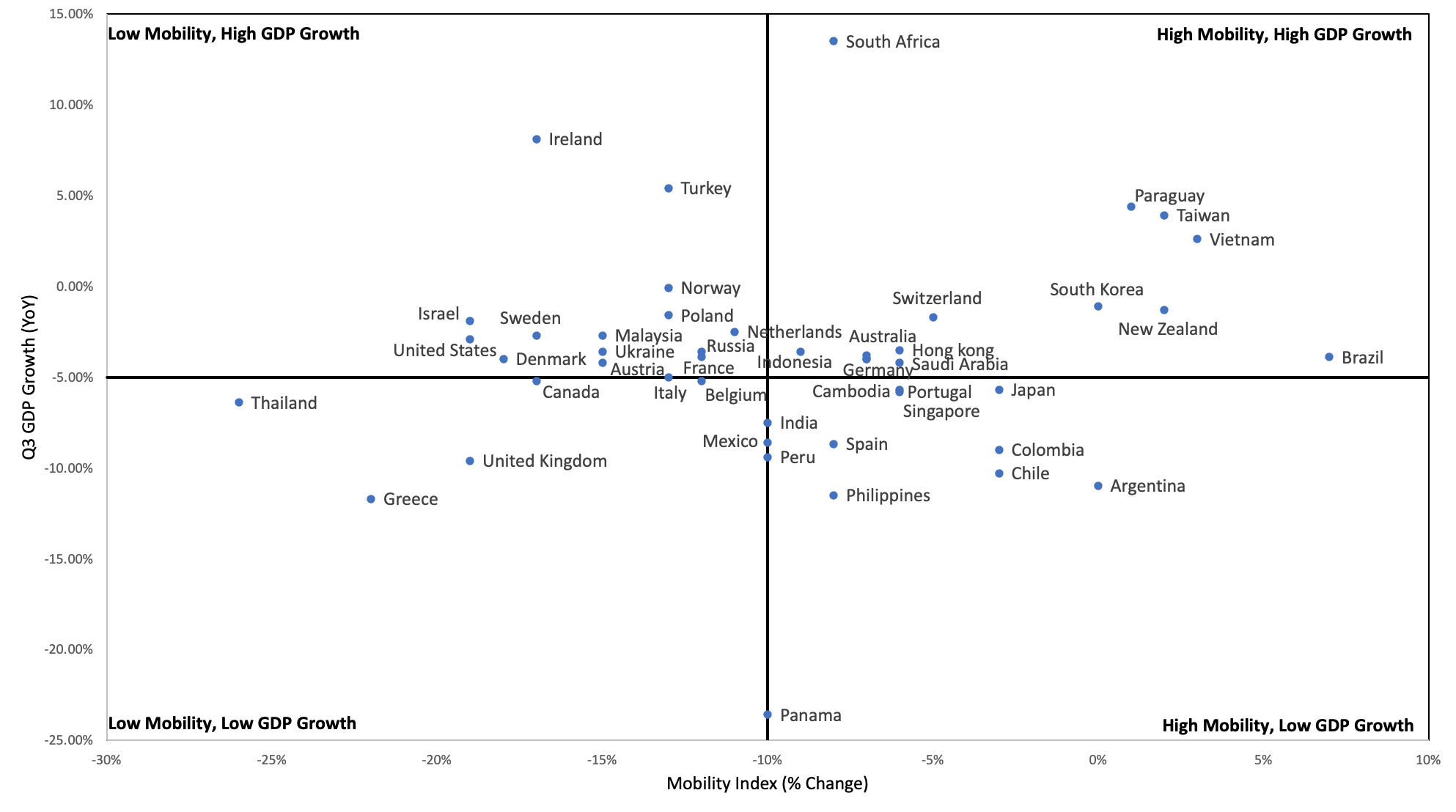
Mobility index compared to the Q3 GDP growth (year over year)
A low mobility index is representative of countries that took stricter lockdown measures versus those that did not. The higher the mobility index, the fewer restrictions because there was more movement in workplaces and residential areas. The GDP is a percent change in GDP compared to the same time last year (Q3 2019).
| The top left quadrant shows the countries that had a low mobility index and a relatively high GDP growth. Ireland and Turkey were able to grow their GDP despite being locked down. | The top right quadrant shows that Paraguay, Taiwan and Vietnam had a high mobility index while still maintaining GDP growth. |
| The bottom left quadrant shows the countries that were under lockdown (low mobility) and had a decline in their Q3 GDP. The U.K. and Greece were the most impacted economically by their lockdowns. | The bottom right quadrant shows the countries that were relatively open and had GDP declines (ex. Argentina, Chile and Colombia). |
The belief is that if a country goes through a lockdown (low mobility), the economy is going to see a negative impact and therefore result in a greater GDP decline. Less movement should lead to less economic growth.
The data supports this notion. The top 10% of countries with highest mobility saw GDP increase an average of 2.85%. The bottom 10% of countries with lowest mobility saw GDP decline an average of 6.50%.
There is a clear correlation between lockdowns and GDP decline. The most open countries experienced an average GDP increase of 2.85%, while the most restricted countries saw GDP decline by an average of 6.50%. Locked down economies suffer more productivity loss than the economies that remain open.
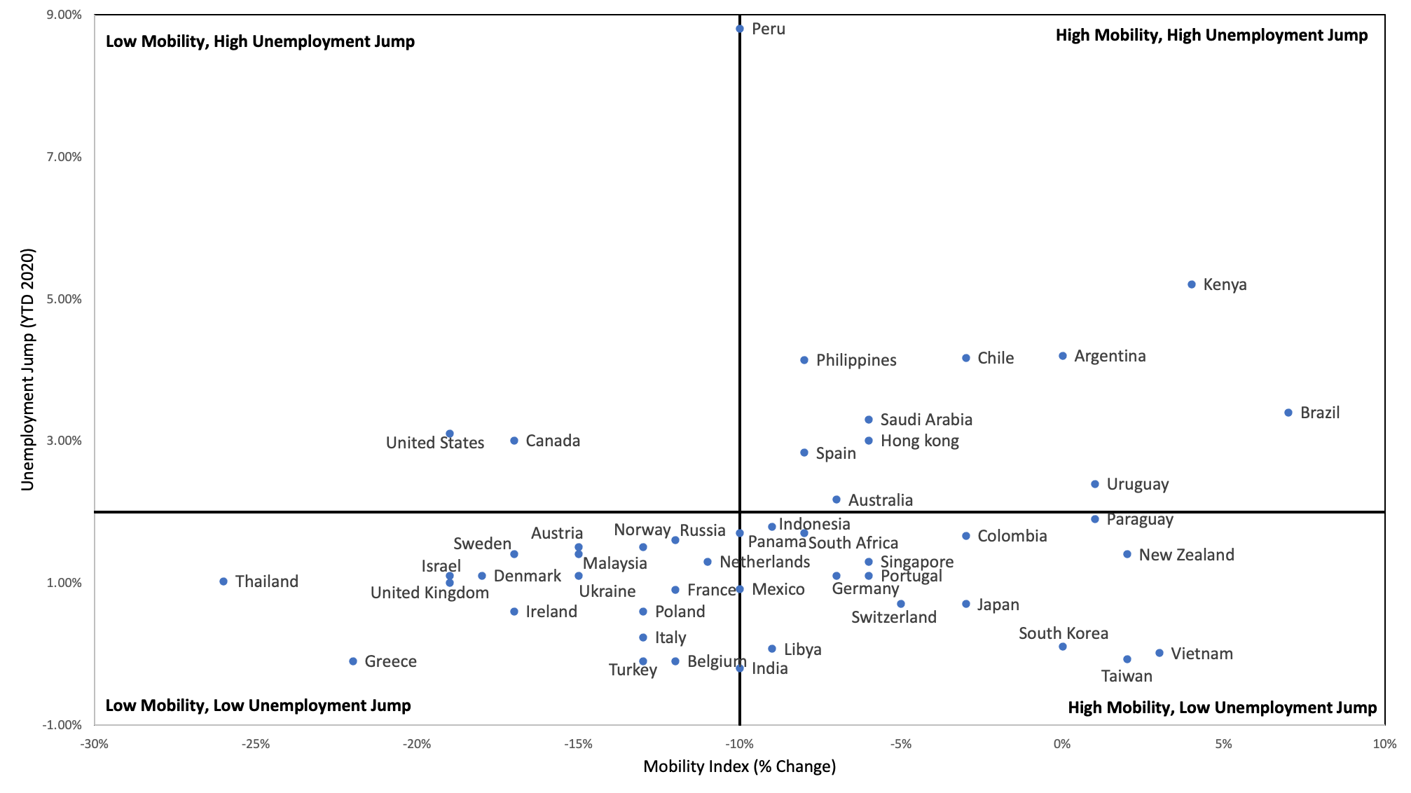
Mobility index compared to the change in unemployment rate (year to date 2020)
The jump in unemployment is the difference between the unemployment rate at the beginning of 2020 versus the most recent 2020 figures. The most recent unemployment data ranges from Q2 to November unemployment numbers.
| Top left quadrant shows that the United States and Canada had a low mobility index and a high unemployment jump. This means that these countries went into lockdown and thus, the highest proportion of people lost their jobs. | Top right quadrant shows that Brazil and Kenya were unable to maintain their jobs despite not being under strict lockdown policies. |
| Bottom left quadrant shows the countries that were under lockdown and were able to keep their job markets relatively stable. Belgium and Turkey kept their unemployment rates the same as before COVID, even with a decline in mobility. | Bottom right quadrant shows the countries that were not under strict lockdown and kept their job market relatively stable. Vietnam and Taiwan did not see a change in unemployment rate during 2020. |
On average, unemployment was not impacted by mobility. This can most likely be attributed to work-from-home policies, which had a large number of people remaining employed even with offices being shutdown.
The top 10% of countries with the highest mobility saw unemployment rate increase by an average of 1.99% in 2020. The bottom 10% of countries with lowest mobility saw unemployment rate increase by an average of 1.22%.
Lockdowns did not have a material impact on the unemployment rate. In fact, the countries with stricter lockdowns experienced a smaller jump in unemployment rate, than countries that remained open. Technological advances and work-from-home policies are two factors that positively impacted unemployment, and as a result, saved many jobs that would have otherwise been lost.
Healthcare Data
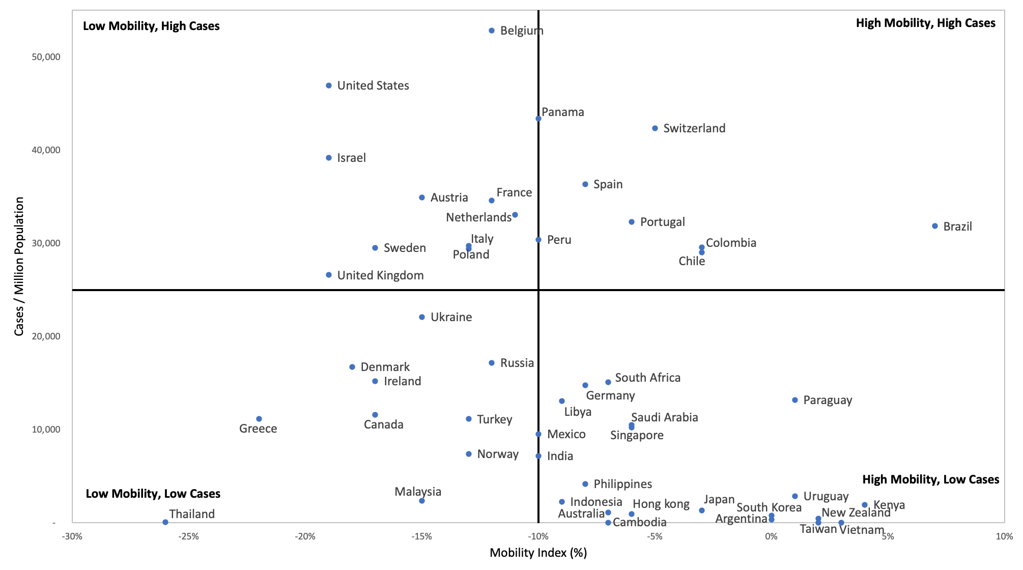
Mobility index compared to COVID cases/1M population
This graph compares the mobility index with the number of COVID cases/million population. The number of cases/million people is the number of people infected with COVID-19 for every million people in the population. The higher the number, the more COVID cases the country was seeing per capita.
| Top left quadrant shows that countries like Israel and the U.S.A, with strict lockdown measures, still had a high number of relative COVID cases. | Top right quadrant shows that Brazil and Chile had a high mobility index and as expected, a high number of cases. More movement = more transmission. |
|
Bottom left quadrant shows the countries that maintained a lockdown and were able to keep their COVID cases relatively low. These countries included Thailand and Greece. |
Bottom right quadrant shows the countries that were not under strict lockdown and had low cases. New Zealand, Taiwan and Vietnam were able to maintain a low case number despite not being locked down. |
According to the data shown on the graph, mobility had no correlation to the number of cases. In fact, the opposite is seen. More lockdown = more cases. This is likely due to lockdown measures being taken as a reactive measure to rising cases. When cases are on the rise, policymakers take actions to restrict movements to halt the spread of COVID.
The top 10% of countries with highest mobility saw an average of 6,843 cases/1M people. The bottom 10% of countries with lowest mobility saw an average of 24,784 cases/1M people.
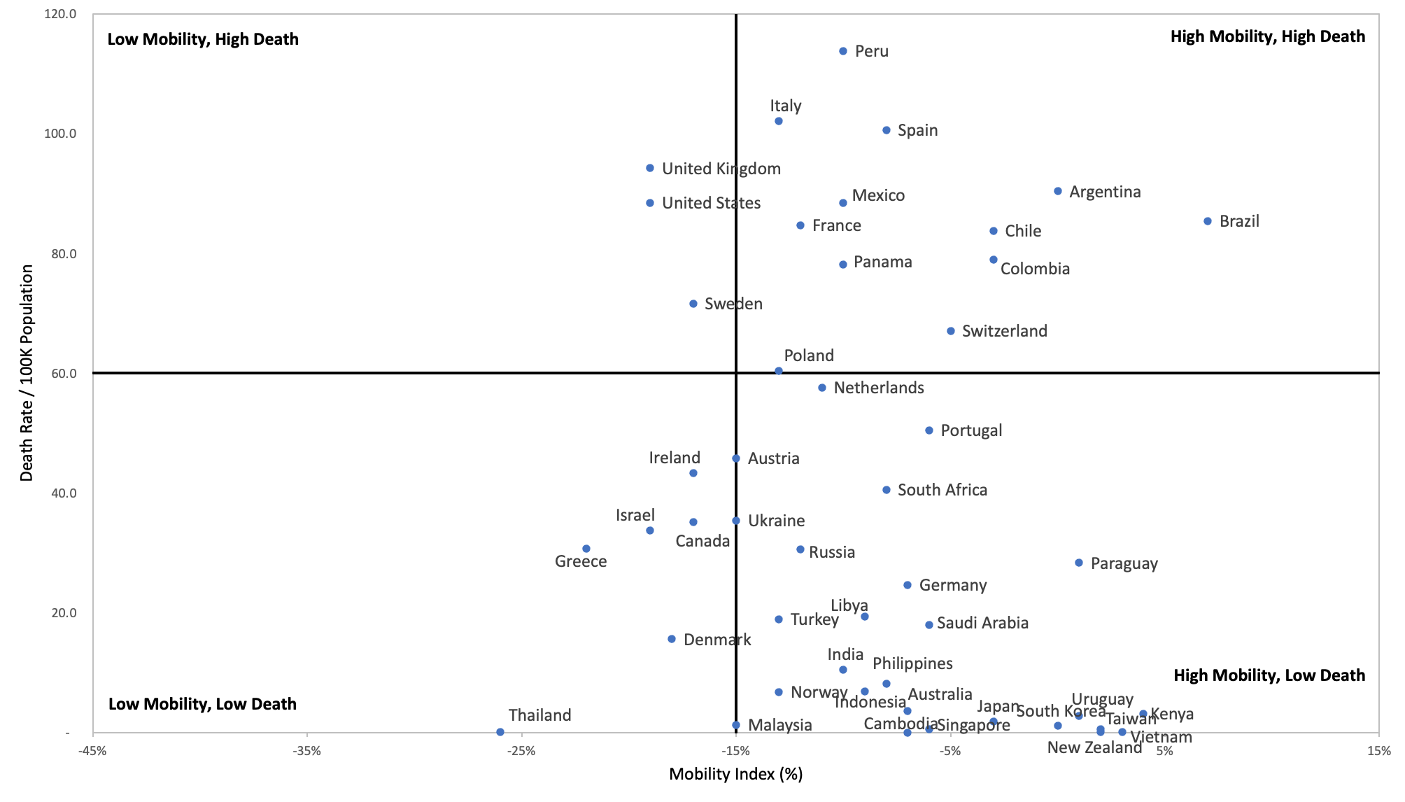
Mobility index compared to COVID death rate / 100K population
This graph compares the mobility index with the death rate/100K population. The death rate/100K population is the number of people that died for every 100,000 people in the population.
| Top left quadrant shows that the U.S.A and U.K. had a high death rate despite being under lockdown (low mobility). | Top right quadrant shows that were not under strict lockdown and had a high death rate. |
|
Bottom left quadrant shows the countries that maintained a low death rate while under lockdown (ie. Thailand, Denmark).
|
Bottom right quadrant shows the countries that were able to maintain a low death rate despite not being under strict lockdown (ie. New Zealand, South Korea, Taiwan, Vietnam). |
Like the number of cases, countries with stricter lockdown measures have higher death rates than countries with fewer restrictions. This is another metric that is greatly impacted by the reactive policies to rising cases.
The data shows that the top 10% of countries with the highest mobility saw an average of 27 deaths/100K population. The bottom 10% of countries with the lowest mobility saw an average of 49 deaths/100K population.
Data Limitations
The data in the matrices above is a helpful visual representation of the general impacts that lockdown has on health and the economy. It shows how different countries who locked down compare to those that didn’t. However, there are limitations to the data:
- Google’s mobility is tracking the movement in places classified as “workplace” and “residential”. This does not take into account retail, transit stations, parks. So not the most accurate measurement of mobility.
- Google’s Mobility index is a dynamic metric that changes frequently. Countries are shifting between lockdown and no lockdown, which in turn effects their Mobility index.
- GDP/unemployment are not perfect measures of economic output.
- Cases/deaths are generally seen as reactive metrics that countries use to make policies. Many countries went into lockdown only after seeing cases spike.
Overall, the above data shows that enforcing lockdown policies has a negative economic impact on GDP, but not unemployment. The impact on health is not as conclusive, mostly because cases & deaths are not an accurate measure. This is due to countries enforcing lockdowns to halt the spread of COVID after an outbreak.
The follow-up article will analyze the effectiveness of lockdowns on halting the spread of COVID.


